
지피티활용능력1급
2023.07.31 모각코 5회차 결과 본문
보통 애니메이션과 상호작용 등은 자바스크립트를 통해 만드는 것이지만 css로도 충분히 애니메이션을 표현할 수 있다.
div박스를 활용해 기본적인 틀을 잡아놓고 애니메이션 효과를 적절하게 주면 된다.


이런 식으로 위의 점 세개가 가운데 점을 기준으로 빙글빙글 돌아가고 아래의 막대들이 순서대로 커졌다 작았다는 반복하는 모습의 애니메이션을 만들 것이다.
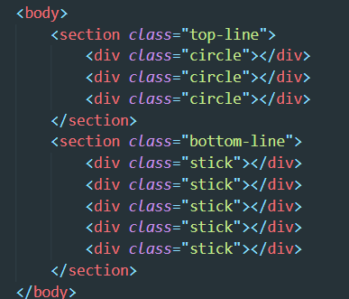
html은 간단하게 이렇게 만들 수 있다.

먼저 body 태그를 설정해준다.
margin과 padding을 모두 0으로 설정했으며
위와 같이 작성해 모든 요소들이 화면 정가운데에 위치하도록 하였다.

위의 점들과 아래의 박스를 각각 top-line, bottom-line의 클래스로 묶어주었으며 해당 클래스의 div속에서도 정가운데 오도록 코드를 작성했다.

border-radius를 50%로 설정하면 원을 만들 수 있다.
아래 animation은 애니메이션을 위한 설정이다.
애니메이션의 이름, 지속시간, 어떤 방식으로 보이게 할 것인지 등을 입력해주면 되는데 나는 flexSticks라는 애니메이션을 1초동안 ease-in-out 방식으로 계속 나타나게 했다.

그렇다면 위 그림을 움직이게 할 flexSticks의 애니메이션 동작에 대해 알아보자

@keyframes와 애니메이션 이름을 설정해서 적어주고 애니메이션을 설정해주자
0% 부터 100%부터 동작을 설정할 수 있는데 적절히 조절해서 부드러운 동작을 만들 수 있다.
나 같은 경우는 0~70%까지 설정해주었고 Y축으로 2배만큼 늘어났다가 다시 줄어드는 scaleY()를 이용했다.
그냥 처음과 끝만 설정하려면 from{} to{}를 설정해주면 된다.

그리고 각 스틱별로 딜레이를 줘서 한번에 움직이지 않고 부드럽게 파도를 타는 듯한 애니메이션을 주고자 animation-dalay를 각 스틱별로 0.1초씩 다르게 설정했다.

그리고 회전을 줘야하는 위의 세 점들은 keyframes를 rotateCircle로 설정하여 애니메이션 효과를 주었다.
rotateZ를 활용해 0도에서 180도까지 Z축을 기준으로 한바퀴를 돌게 하였고
top-line 클래스에 애니메이션을 주었다.
이렇게 코드를 작성하면 쉽게 애니메이션을 동작하는 웹을 설계할 수 있다.
전체 css코드
body {
    height: 100vh;
    background-color: rgb(132, 210, 201);
    margin: 0;
    padding: 0;
    display: flex;
    flex-direction: column;
    align-items: center;
    justify-content: center;
}

.top-line {
    display: flex;
    align-items: center;
    justify-content: center;
    animation: rotateCircle 1s ease-in-out infinite;
}
.bottom-line {
    display: flex;
    align-items: center;
    justify-content: center;
}

.circle {
    border-radius: 50%;
    margin: 20px;
    width: 10px;
    height: 10px;
    background-color: white;
}

.stick {
    width: 10px;
    height: 40px;
    background-color: white;
    margin: 2px;
    align-items: center;
    display: flex;
    position: relative;
    top: 80px;
    animation: flexSticks 1s ease-in-out infinite;
    animation-delay: 0.5s;
}
.stick:first-child {
    animation-delay: 0.5s;
}
.stick:nth-child(2) {
    animation-delay: 0.6s;
}
.stick:nth-child(3) {
    animation-delay: 0.7s;
}
.stick:nth-child(4) {
    animation-delay: 0.8s;
}
.stick:nth-child(5) {
    animation-delay: 0.9s;
}

@keyframes rotateCircle {
    from {
        transform: rotateZ(0);
    }
    to {
        transform: rotateZ(180deg);
    }
}
@keyframes flexSticks {
    0% {
        transform: scaleY(1);
    }
    50% {
        transform: scaleY(2);
    }
    70% {
        transform: scaleY(1);
    }
}
'2023 하계 모각코' 카테고리의 다른 글
| 2023.08.11 모각코 6회차 결과 (0) | 2023.08.12 |
|---|---|
| 2023.08.11 모각코 6회차 목표 (0) | 2023.08.12 |
| 2023.07.31 모각코 5회차 목표 (0) | 2023.08.04 |
| 2023.07.25 모각코 4회차 결과 (0) | 2023.07.27 |
| 2023.07.25 모각코 4회차 목표 (0) | 2023.07.26 |

